.png)
The Ledger — Design Language
BHAKTA Spirits redesign
v1 · July 2026
v1 · July 2026
01 · Logo
The elephant lockup is used as-is — never re-typeset, recolored, or separated from its wordmark. Minimum height 44px in navigation, 72px preferred.
Clear space: half the elephant’s width on all sides. Always on deep green or near-black grounds.
02 · Color
{{ c.name }}
{{ c.hex }}
{{ c.use }}
03 · Typography
Market Deco
Display / 64–40px
Display / 64–40px
Time, kept in a bottle.
Market Deco caps · gold
Section headline & CTA / 20px · +.4em
Section headline & CTA / 20px · +.4em
Begin with the Moment
Market Deco caps
Card / box label / 16px · +.2em
Card / box label / 16px · +.2em
Gift a Birth Year
Market Deco caps · small
Micro label / 12px · +.3em
Micro label / 12px · +.3em
House Blend · Est. Gascony
Cinzel Bold
Vintages & numerals / any size
Vintages & numerals / any size
1868 · 250
Cormorant Garamond 400
Body / 19–17px
Body / 19–17px
Single-vintage Armagnacs and rare American whiskeys, drawn from a cellar that spans three centuries.
Cormorant italic
Voice / 21–16px
Voice / 21–16px
1969 — the year of the Moon landing.
Keeping it light
Market Deco is reserved for short, letterspaced caps — labels, headlines, buttons — never sentence-length text. Anything that reads as a sentence stays in Cormorant. That split is what keeps the label system present without the page turning heavy. Hierarchy: gold headline 20px > box caps 16px > micro label 12px; body 17–19px sits between.
04 · Components
Primary Action
Secondary
Tertiary Link →
Badge
Filter Chip
Chip · Active
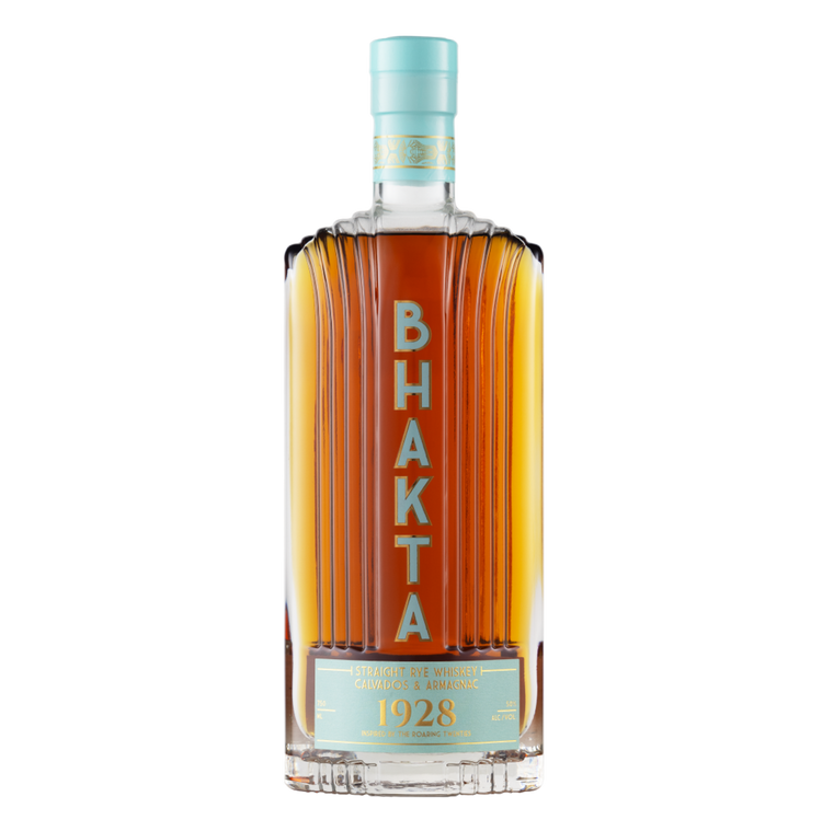
1928
House Blend
BHAKTA 1928
The signature pour
$75
Product cards carry a ghosted vintage year in the image corner, centered text, and a 1px gold-tint border that brightens on hover. Rules everywhere are 1px gold at 14–25% opacity — never solid dividers.
radius: 0 (sharp edges everywhere)
borders: 1px rgba(201,164,92,.14–.5)
section padding: 80px / 56px
card grid gap: 28–32px
buttons: 56–58px tall, letterspaced caps
borders: 1px rgba(201,164,92,.14–.5)
section padding: 80px / 56px
card grid gap: 28–32px
buttons: 56–58px tall, letterspaced caps
05 · How It Should Feel
Rare.
Refined.
Desirable.
Desire
They should want the bottle, not just understand it. Hero bottles large, lit, tactile.
Confidence
Price, specs, and the next step always in reach. The purchase feels clear and justified.
Curiosity
Every bottle hints at a deeper story — offered in accordions and journals, never forced.
Privilege
Numbered bottles, allocation counts, member-first releases. Discovered, not advertised.
Warmth
Never cold or museum-like. Warm light, human photography, quietly generous copy.
Anticipation
Every purchase points to a future moment — a gift, a dinner, a story told over a pour.
“Visitors should feel like they have discovered something rare, beautiful, and worth owning — with enough confidence to buy it.”
06 · Voice
We say
“Your Cellar” — not “Your Cart”
“One of 250 bottles” — not “Limited stock!”
“Find their year” — not “Shop gifts”
“The cellar is yours.” — not “Order confirmed!”
“One of 250 bottles” — not “Limited stock!”
“Find their year” — not “Shop gifts”
“The cellar is yours.” — not “Order confirmed!”
Never
Exclamation marks · discount urgency · emoji
“Premium” or “luxury” as adjectives
Countdown timers · scarcity pop-ups
Re-typesetting the wordmark
“Premium” or “luxury” as adjectives
Countdown timers · scarcity pop-ups
Re-typesetting the wordmark